纯css3实现的switch开关按钮
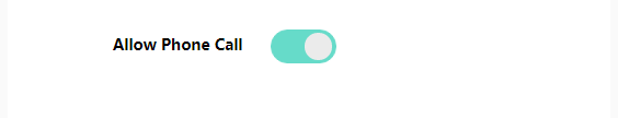
效果如图
<p>
  <label><input class="mui-switch mui-switch-anim" type="checkbox" checked></label>
</p>
.mui-switch {
    width: 60px;
    height: 31px;
    position: relative;
    border: 1px solid #dfdfdf;
    background-color: #fdfdfd;
    box-shadow: #dfdfdf 0 0 0 0 inset;
    border-radius: 20px;
    border-top-left-radius: 20px;
    border-top-right-radius: 20px;
    border-bottom-left-radius: 20px;
    border-bottom-right-radius: 20px;
    background-clip: content-box;
    display: inline-block;
    -webkit-appearance: none;
    user-select: none;
    outline: none;
}

.mui-switch:before {
    content: '';
    width: 25px;
    height: 25px;
    position: absolute;
    top: 2px;
    left: 5px;
    border-radius: 20px;
    border-top-left-radius: 20px;
    border-top-right-radius: 20px;
    border-bottom-left-radius: 20px;
    border-bottom-right-radius: 20px;
    background-color: #ebebeb;
    /*box-shadow: 0 1px 3px rgba(0, 0, 0, 0.4);*/
}

.mui-switch:checked {
    border-color: #66dbc9;
    box-shadow: #66dbc9 0 0 0 16px inset;
    background-color: #66dbc9;
}

.mui-switch:checked:before {
    left: 30px;
    border: none;
}

.mui-switch.mui-switch-anim {
    transition: border cubic-bezier(0, 0, 0, 1) 0.4s, box-shadow cubic-bezier(0, 0, 0, 1) 0.4s;
}

.mui-switch.mui-switch-anim:before {
    transition: left 0.3s;
}

.mui-switch.mui-switch-anim:checked {
    box-shadow: #66dbc9 0 0 0 16px inset;
    background-color: #66dbc9;
    transition: border ease 0.4s, box-shadow ease 0.4s, background-color ease 1.2s;
}

.mui-switch.mui-switch-anim:checked:before {
    transition: left 0.3s;
}
略懂,略懂....