
对于Web开发人员开发方便的CSS3技巧
在CSS编码当中,我们经常需要创建一些特殊的效果,例如多张背景图片如何实现,如何创建一个边框效果,raga兼容IE的问题都是我们需要考虑的,有那样一些代码是在遇到这些问题时候我们可以用到的,经验丰富的CSS程序员通常都知道这一点这一次,之前给大家分享了一些实用CSS技巧,
今天在给大家分享一下我已经收集了一些有用的CSS3技术这些使用起来都得心应手,可以帮助您在您您的网站上改进用户体验
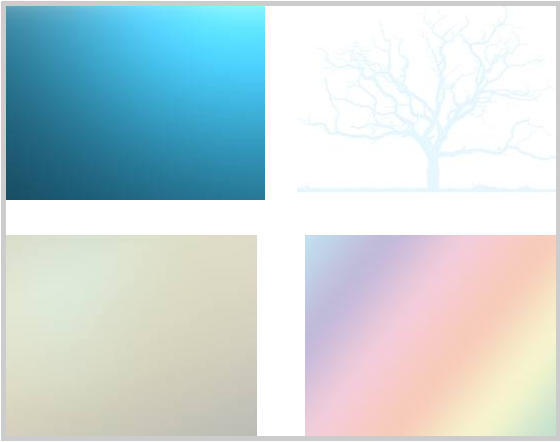
1.创建多背景图片:
CSS3允许让你创建多个背景图片。
#multipleBGDiv{
 border: 5px solid #cccccc;
 background:url(bg1.jpeg) top left no-repeat, url(bg2.jpeg) bottom left no-repeat, url(bg3.jpeg) bottom right no-repeat, url(bg4.jpeg) top right no-repeat;
 padding: 15px 25px;
 height: 400px;
 width: 500px;
}
2 多边框的颜色(仅限Firefox):
使用CSS3,还可以实现多种边框颜色。看看这个。
.borderColor{
 border: 8px solid #000;
 -moz-border-bottom-colors: #033 #039 #777 #888 #999 #aaa #bbb #ccc;
 -moz-border-top-colors:    #033 #039 #777 #888 #999 #aaa #bbb #ccc;
 -moz-border-left-colors:   #033 #039 #777 #888 #999 #aaa #bbb #ccc;
 -moz-border-right-colors:  #033 #039 #777 #888 #999 #aaa #bbb #ccc;
 width:400px;
}
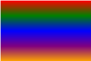
3. 彩虹效果:
 1 .rainbow  {
 2  /* fallback */
 3  background-color:#063053;
 4  /* chrome 2+, safari 4+; multiple color stops */
 5  background-image:-webkit-gradient(linear,left bottom,left top,color-stop(0.20,red),color-stop(0.40,green), color-stop(0.6,blue), color-stop(0.8,purple), color-stop(1,orange));
 6  /* chrome 10+, safari 5.1+ */
 7  background-image:-webkit-linear-gradient(,green,blue,purple,orange);
 8  /* firefox; multiple color stops */
 9  background-image:-moz-linear-gradient(top,red,green,blue,purple,orange);
10  /* ie10 */
11  background-image: -ms-linear-gradient(red,green,blue,purple,orange);
12  /* opera 11.1 */
13  background-image: -o-linear-gradient(red,green,blue,purple,orange);
14  /* The "standard" */
15  background-image: linear-gradient(red,green,blue,purple,orange);
16 }
4. 阴影效果:
创建文本的阴影。CSS3提供了直接实现文字阴影
.shadow{
 text-shadow: 2px 2px 2px #000;
}
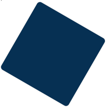
5. 旋转
现在,使用CSS3创建轴旋转样式。
.rotate30deg{
 transform:rotate(30deg);
 -ms-transform:rotate(30deg); /* IE 9 */
 -moz-transform:rotate(30deg); /* Firefox */
 -webkit-transform:rotate(30deg); /* Safari and Chrome */
 -o-transform:rotate(30deg); /* Opera */
 background-color:#063053;
 border:2px solid #e9e9e9;
 height:300px;
 width:300px;
 border-radius:15px;
 margin:50px;
}
6. 创建箱子阴影效果:
.
.boxShadow
{
 box-shadow: 10px 10px 5px #888888;
 -webkit-box-shadow: 10px 10px 5px #888888; /* Safari */
}
7. 时尚的背景按钮效果:
.button {
    -webkit-box-shadow: inset 0px -3px 1px rgba(0, 0, 0, 0.45), 0px 2px 2px rgba(0, 0, 0, 0.25);
    -moz-box-shadow: inset 0px -3px 1px rgba(0, 0, 0, 0.45), 0px 2px 2px rgba(0, 0, 0, 0.25);
    box-shadow: inset 0px -3px 1px rgba(0, 0, 0, 0.45), 0px 2px 2px rgba(0, 0, 0, 0.25);
    -webkit-border-radius: 3px;
    -moz-border-radius: 3px;
    border-radius: 3px;
    text-shadow: 1px 1px 0px rgba(0, 0, 0, 0.5);
 background: #67b600;
    padding: 10px;
    text-decoration: none;
    text-shadow: 1px 1px 0 rgba(0, 0, 0, 0.5);
 color:#fff;
}
.button.gradient {
 background-image: -webkit-gradient(
  linear,
  left bottom,
  left top,
  color-stop(0.1, rgba(0,0,0,0.3)),
  color-stop(1, rgba(255,255,255,0.2))
 );
 background-image: -moz-linear-gradient(
  center bottom,
  rgba(0,0,0,0.3) 1%,
  rgba(255,255,255,0.2) 100%
 );
 background-image: gradient(
  center bottom,
  rgba(0,0,0,0.3) 1%,
  rgba(255,255,255,0.2) 100%
 );
}

.button.gradient:hover {
 background-image: -webkit-gradient(
  linear,
  left bottom,
  left top,
  color-stop(0.1, rgba(0,0,0,0.45)),
  color-stop(1, rgba(255,255,255,0.3))
 );
 background-image: -moz-linear-gradient(
  center bottom,
  rgba(0,0,0,0.45) 1%,
  rgba(255,255,255,0.3) 100%
 );
 background-image: gradient(
  center bottom,
  rgba(0,0,0,0.45) 1%,
  rgba(255,255,255,0.3) 100%
 );
}
.button:active { position: relative; top: 3px;
    -webkit-box-shadow: inset 0px -3px 1px rgba(255, 255, 255, 1), inset 0 0px 3px rgba(0, 0, 0, 0.9);
    -moz-box-shadow: inset 0px -3px 1px rgba(255, 255, 255, 1), inset 0 0px 3px rgba(0, 0, 0, 0.9);
    box-shadow: inset 0px -3px 1px rgba(255, 255, 255, 1), inset 0 0px 3px rgba(0, 0, 0, 0.9);
}
.button:active:after { content: ""; width: 100%; height: 3px; background: #fff; position: absolute; bottom: -1px; left: 0; }

8. CSS3 多列排序:
在一个DIV中进行多列排版显示
.3column{
 text-align: justify;
 -moz-column-count: 3;
 -moz-column-gap: 1.5em;
 -moz-column-rule: 1px solid #c4c8cc;
 -webkit-column-count: 3;
 -webkit-column-gap: 1.5em;
 -webkit-column-rule: 1px solid #c4c8cc;
}
9 CSS3 透明度:
简化CSS3创建不透明.
.opac{
 opacity:.30;/*Backward compatibility*/
 filter: alpha(opacity=value);/*IE*/
 -moz-opacity:.30;/*Mozilla*/
}
10. 创建梯度背景:
.linearBg2 {
  /* fallback */
  background-color: #1a82f7;
  background: url(bg1.jpeg);
  background-repeat: repeat-x;

  /* Firefox 3.6+ */
  background: -moz-linear-gradient(100% 100% 90deg, #2F2727, #1a82f7);

  /* Safari 4-5, Chrome 1-9 */
  /* -webkit-gradient(,  [, ]?,  [, ]? [, ]*) */
  background: -webkit-gradient(linear, 0% 0%, 0% 100%, from(#1a82f7), to(#2F2727));

  /* Safari 5.1+, Chrome 10+ */
  background: -webkit-linear-gradient(#2F2727, #1a82f7);

  /* Opera 11.10+ */
  background: -o-linear-gradient(#2F2727, #1a82f7);
}


 浙公网安备 33010602011771号